Build beautiful UI with 100+ powerful components

Build your Vue or Nuxt application faster with Nuxt UI and Nuxt UI Pro components. Powered by Tailwind CSS and Reka UI, delivering responsive and customizable components.

Element

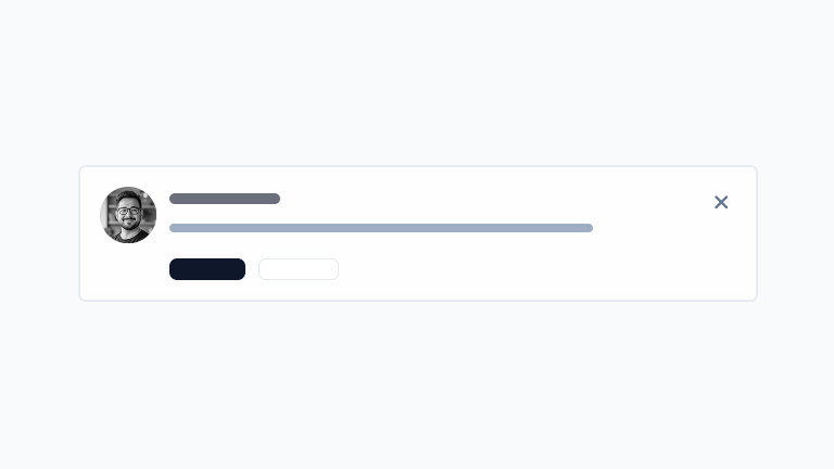
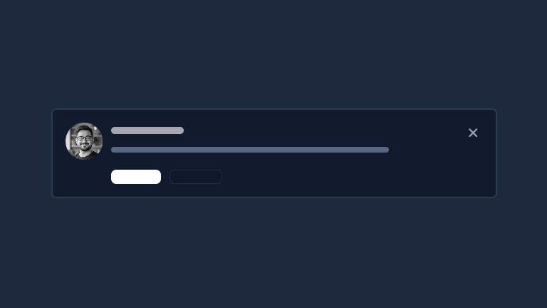
Core UI building blocks like buttons, badges, icons, avatars, and other fundamental interface elements.
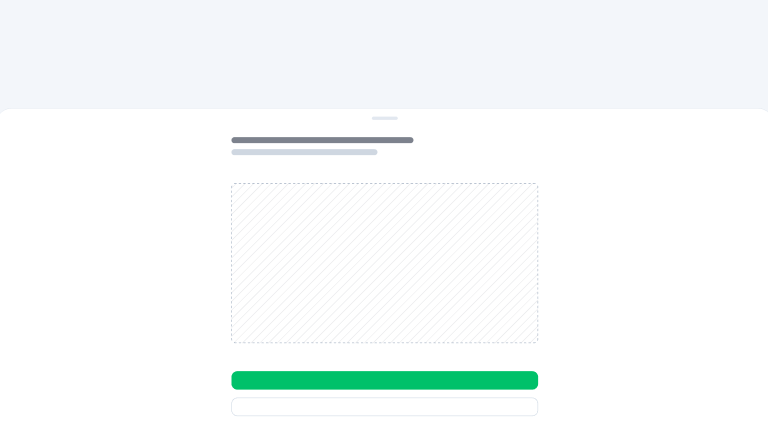
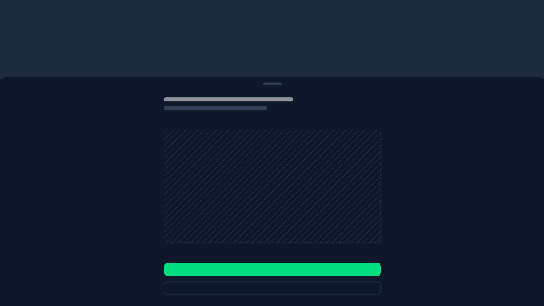
Alert
A callout to draw user's attention.
undefined preview
Avatar
An img element with fallback and Nuxt Image support.
undefined preview
AvatarGroup
Stack multiple avatars in a group.
undefined preview
Badge
A short text to represent a status or a category.
undefined preview
Button
A button element that can act as a link or trigger an action.
undefined preview
ButtonGroup
Group multiple button-like elements together.
undefined preview
Calendar
A calendar component for selecting single dates, multiple dates or date ranges.
undefined preview
Chip
An indicator of a numeric value or a state.
undefined preview
Collapsible
A collapsible element to toggle visibility of its content.
undefined preview
ColorModeAvatarPRO
An Avatar with a different source for light and dark mode.
undefined preview
ColorModeButtonPRO
A Button to switch between light and dark mode.
undefined preview
ColorModeImagePRO
An image element with a different source for light and dark mode.
undefined preview
ColorModeSelectPRO
A Select to switch between system, dark & light mode.
undefined preview
ColorModeSwitchPRO
A switch to toggle between light and dark mode.
undefined preview
ContentSearchButtonPRO
A pre-styled Button to open the ContentSearch modal.
undefined preview
DashboardSearchButtonPRO
A pre-styled Button to open the DashboardSearch modal.
undefined preview
DashboardSidebarCollapsePRO
A Button to collapse the sidebar on desktop.
undefined preview
DashboardSidebarTogglePRO
A Button to toggle the sidebar on mobile.
undefined preview
Icon
A component to display any icon from Iconify.
undefined preview
Keyboard Key
A kbd element to display a keyboard key.
undefined preview
LocaleSelectPRO
A Select to switch between locales.
undefined preview
Progress
An indicator showing the progress of a task.
undefined preview

Form

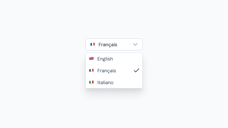
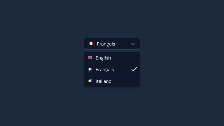
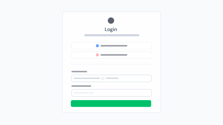
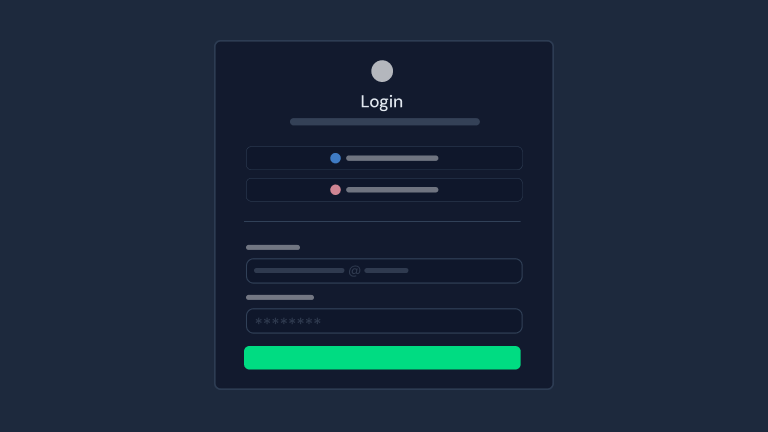
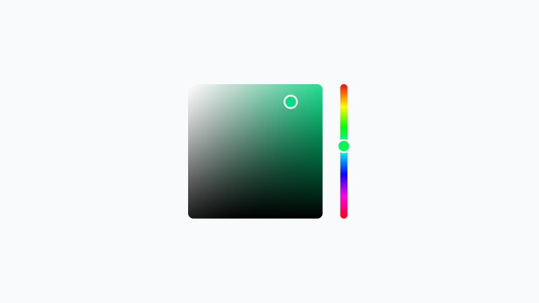
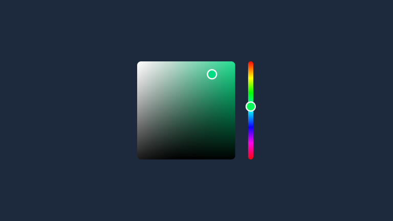
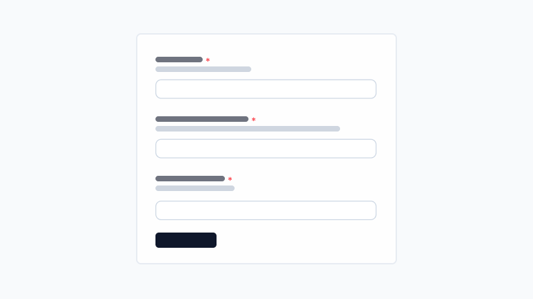
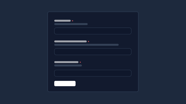
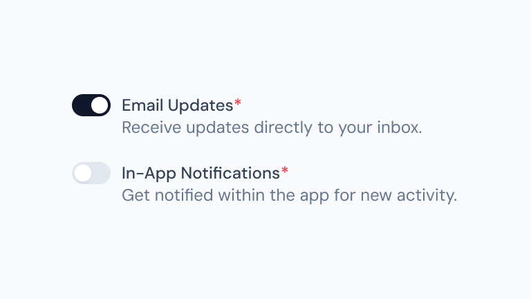
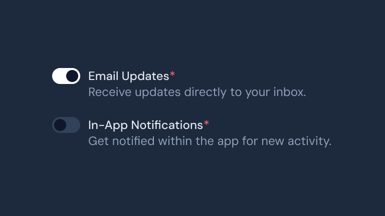
Interactive form elements including inputs, selects, checkboxes, radio buttons, and advanced form validation components.
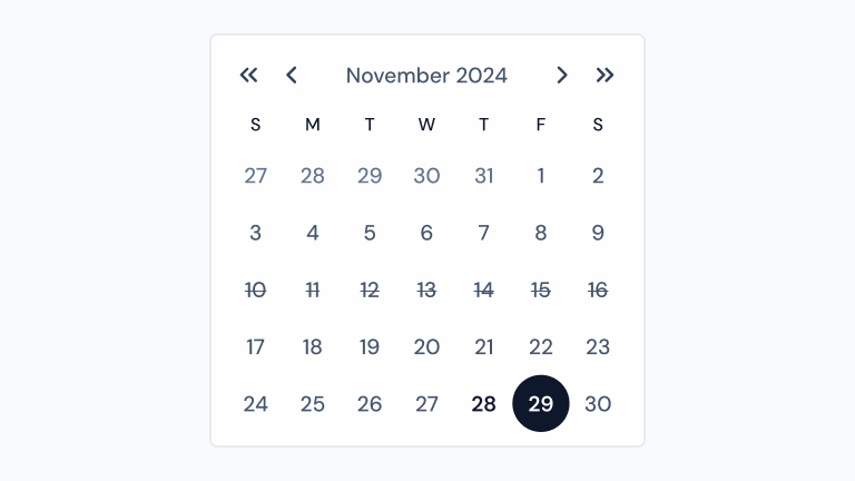
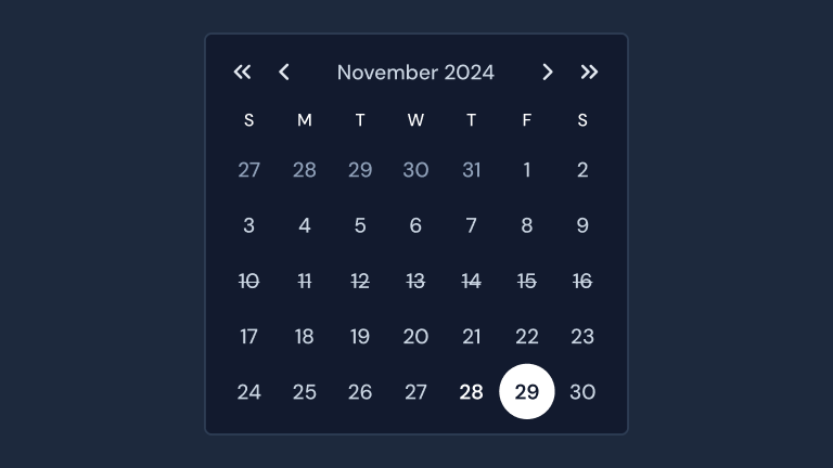
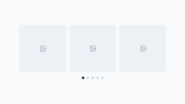
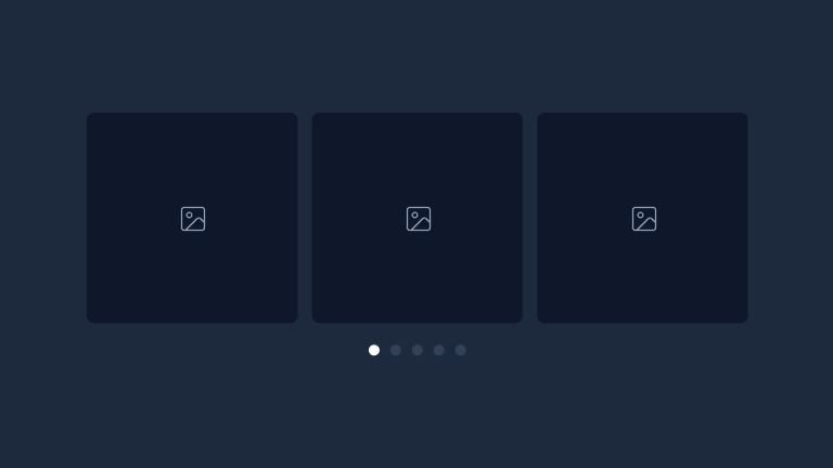
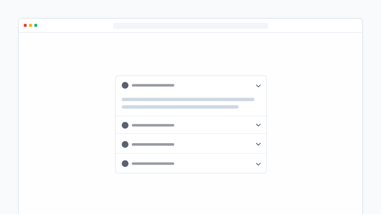
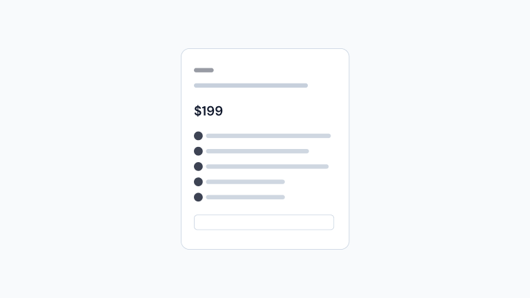
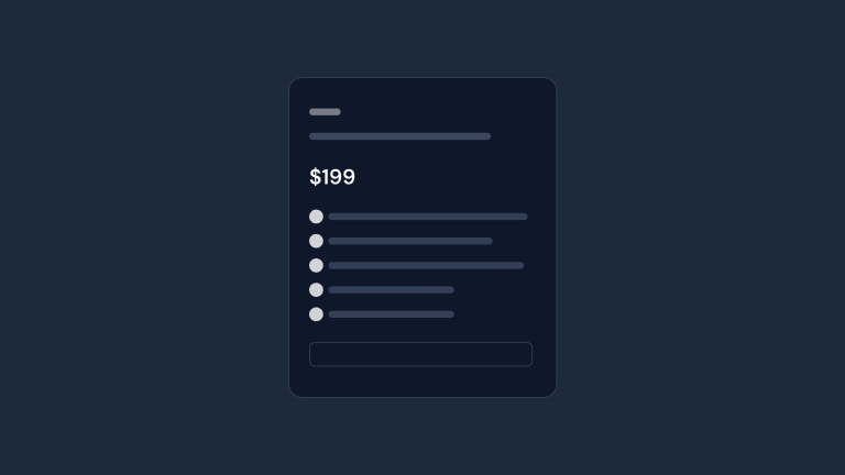
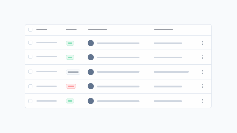
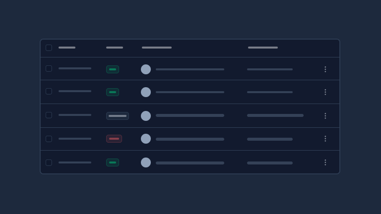
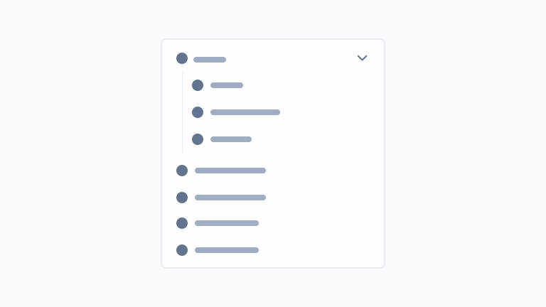
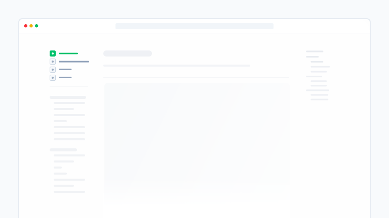
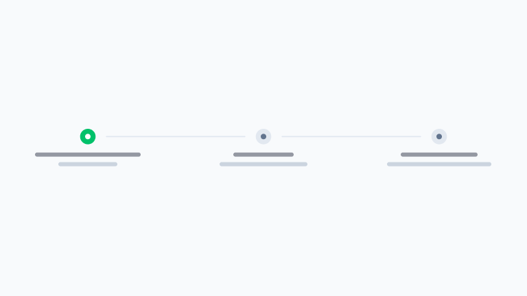
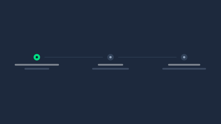
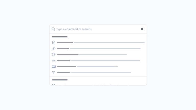
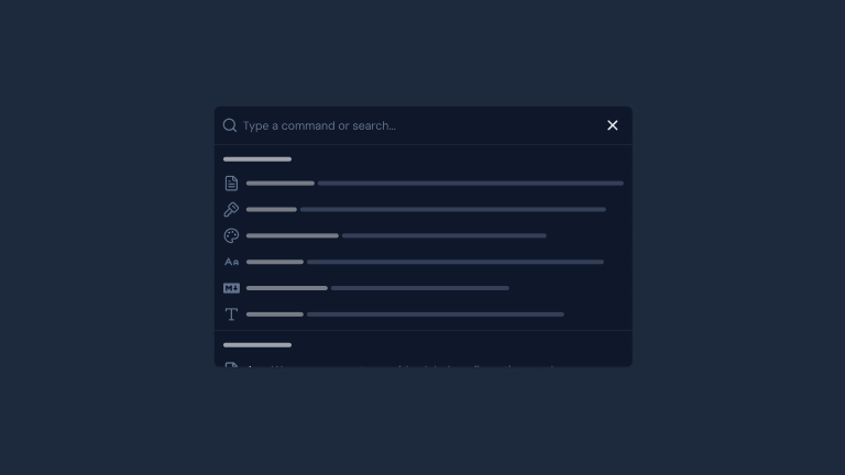
AuthFormPRO
A customizable Form to create login, register or password reset forms.
undefined preview
Checkbox
An input element to toggle between checked and unchecked states.
undefined preview
ColorPicker
A component to select a color.
undefined preview
Form
A form component with built-in validation and submission handling.
undefined preview
FormField
A wrapper for form elements that provides validation and error handling.
undefined preview
Input
An input element to enter text.
undefined preview
InputMenu
An autocomplete input with real-time suggestions.
undefined preview
InputNumber
Input numerical values with a customizable range.
undefined preview
PinInput
An input element to enter a pin.
undefined preview
RadioGroup
A set of radio buttons to select a single option from a list.
undefined preview
Select
A select element to choose from a list of options.
undefined preview
SelectMenu
An advanced searchable select element.
undefined preview
Slider
An input to select a numeric value within a range.
undefined preview
Switch
A control that toggles between two states.
undefined preview
Textarea
A textarea element to input multi-line text.
undefined preview

Data

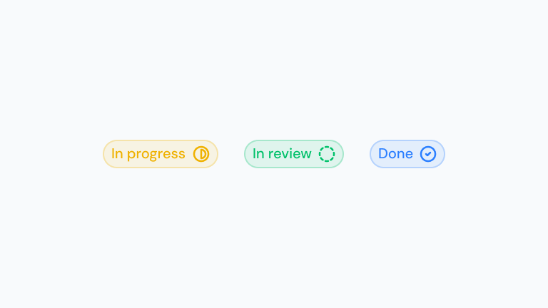
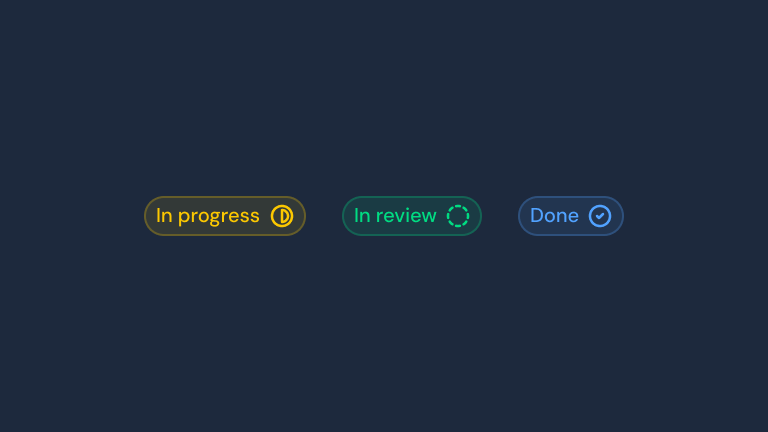
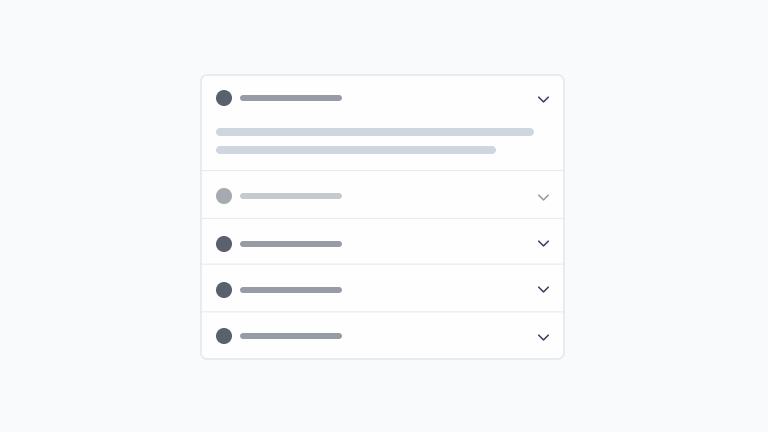
Components for displaying and managing data, including tables, lists, cards, data grids, and visualization elements.
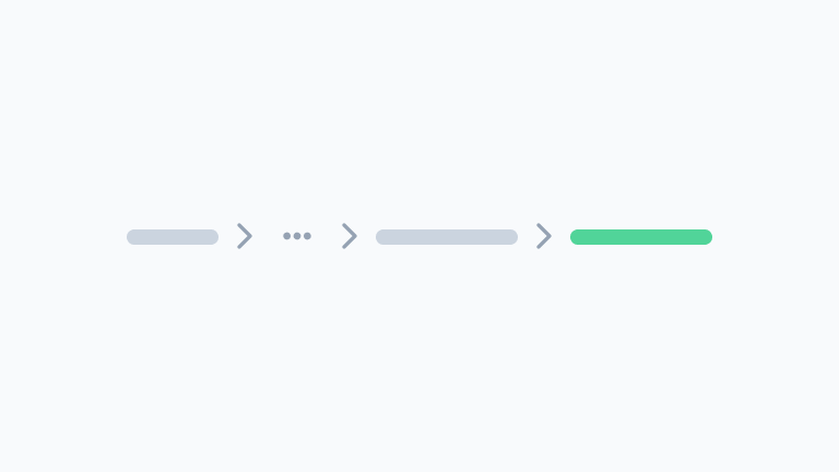
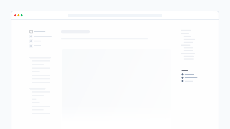
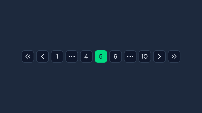
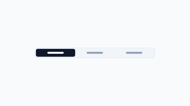
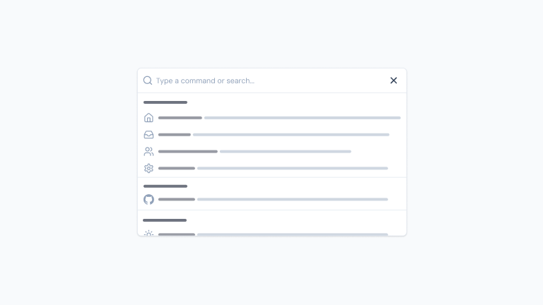
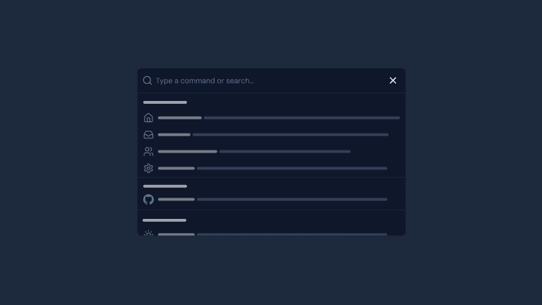
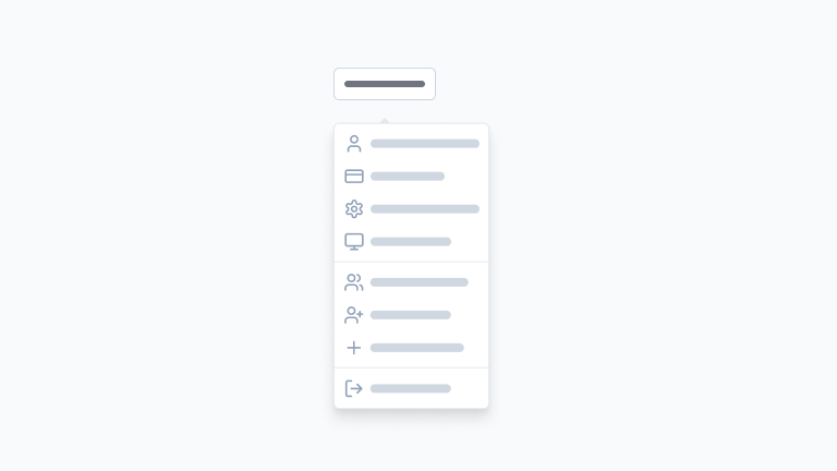
Accordion
A stacked set of collapsible panels.
undefined preview
BlogPostPRO
A customizable article to display in a blog page.
undefined preview
Carousel
A carousel with motion and swipe built using Embla.
undefined preview
PageAccordionPRO
A pre-styled Accordion to display in your pages.
undefined preview
PageCardPRO
A pre-styled card component that displays a title, description and optional link.
undefined preview
PageCTAPRO
A call to action section to display in your pages.
undefined preview
PageFeaturePRO
A component to showcase key features of your application.
undefined preview
PageHeaderPRO
A responsive header for your pages.
undefined preview
PageHeroPRO
A responsive hero for your pages.
undefined preview
PageLogosPRO
A list of logos or images to display on your pages.
undefined preview
PageMarqueePRO
A component to create infinite scrolling content.
undefined preview
PageSectionPRO
A responsive section for your pages.
undefined preview
PricingPlanPRO
A customizable pricing plan to display in a pricing page.
undefined preview
Table
A responsive table element to display data in rows and columns.
undefined preview
Tree
A tree view component to display and interact with hierarchical data structures.
undefined preview
UserPRO
Display user information with name, description and avatar.
undefined preview

Navigation

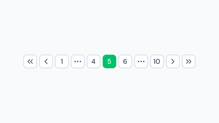
Components for user navigation and wayfinding, including menus, breadcrumbs, pagination, and navigation bars.
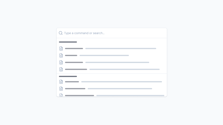
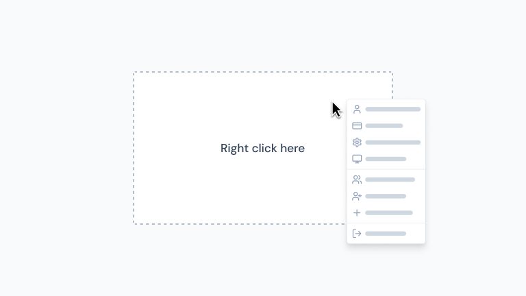
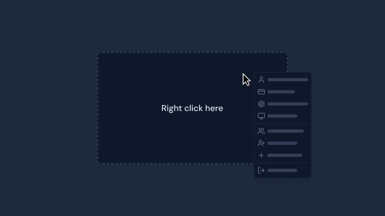
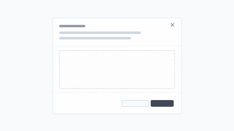
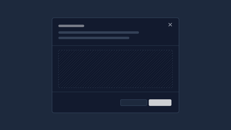
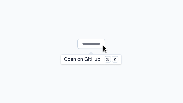
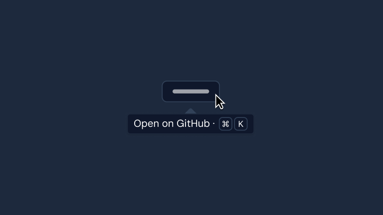
Overlay

Floating UI elements like modals, dialogs, tooltips, popovers, and other components that overlay the main content.
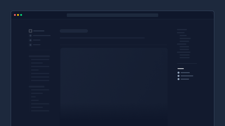
ContentSearchPRO
A ready to use CommandPalette to add to your documentation.
undefined preview
ContextMenu
A menu to display actions when right-clicking on an element.
undefined preview
DashboardSearchPRO
A ready to use CommandPalette to add to your dashboard.
undefined preview
Drawer
A drawer that smoothly slides in & out of the screen.
undefined preview
DropdownMenu
A menu to display actions when clicking on an element.
undefined preview
Modal
A dialog window that can be used to display a message or request user input.
undefined preview
Popover
A non-modal dialog that floats around a trigger element.
undefined preview
Slideover
A dialog that slides in from any side of the screen.
undefined preview
Toast
A succinct message to provide information or feedback to the user.
undefined preview
Tooltip
A popup that reveals information when hovering over an element.
undefined preview

Layout

Structural components for organizing content, including containers, grids, dividers, and responsive layout systems.

App
Wraps your app to provide global configurations and more.
undefined preview
BannerPRO
Display a banner at the top of your website to inform users about important information.
undefined preview
BlogPostsPRO
Display a list of blog posts in a responsive grid layout.
undefined preview
Card
Display content in a card with a header, body and footer.
undefined preview
Container
A container lets you center and constrain the width of your content.
undefined preview
DashboardGroupPRO
A fixed layout component that provides context for dashboard components with sidebar state management and persistence.
undefined preview
DashboardNavbarPRO
A responsive navbar to display in a dashboard.
undefined preview
DashboardPanelPRO
A resizable panel to display in a dashboard.
undefined preview
DashboardResizeHandlePRO
A handle to resize a sidebar or panel.
undefined preview
DashboardSidebarPRO
A resizable and collapsible sidebar to display in a dashboard.
undefined preview
DashboardToolbarPRO
A toolbar to display under the navbar in a dashboard.
undefined preview
ErrorPRO
A pre-built error component with NuxtError support.
undefined preview
FooterPRO
A responsive footer component.
undefined preview
HeaderPRO
A responsive header component.
undefined preview
MainPRO
A main element that fills the available viewport height.
undefined preview
PagePRO
A grid layout for your pages with left and right columns.
undefined preview
PageAsidePRO
A sticky aside to display your page navigation.
undefined preview
PageBodyPRO
The main content of your page.
undefined preview
PageColumnsPRO
A responsive multi-column layout system for organizing content side-by-side.
undefined preview
PageGridPRO
A responsive grid system for displaying content in a flexible layout.
undefined preview
PageListPRO
A vertical list layout for displaying content in a stacked format.
undefined preview
PricingPlansPRO
Display a list of pricing plans in a responsive grid layout.
undefined preview
Separator
Separates content horizontally or vertically.
undefined preview
Skeleton
A placeholder to show while content is loading.
undefined preview